2016 holiday plans: sorted!

Lego have unveiled the concept art and laid the first bricks for the Lego Experience House in Denmark. I adore the design. It’s blocky and bright and makes some good building-block references without being obsessively Lego-themed.

A building made of stacked white blocks with coloured courtyards on the top of each block. The top block has eight holes in two rows down the block, in the style of a lego block.

This is the first place to make my travel list before it’s built.

Link

The New Library in the Netherlands

The Netherlands has a new library that’s running all the best traditions of libraries – specifically the community space and the books! – up against new technologies and human-centered designs. The results look like my perfect space: open, sunny, sociable and colourful (and full of books!)

Inside the 'New Library', with large open spaces, curving shelves and books facing outwards to grab people's interest like they would in a bookshop.

While this isn’t the sort of context it’s normally mentioned in, this library seems like a great example of human-centered design. It’s combining knowledge from other industries like marketing with the curation and knowledge-sharing skills that are at the heart of a great library. I’m hoping to see a lot more of this sort of library design. Judging by my last visit, Adelaide Library is also a long way down the right track.

The 'New Library' at dusk, showing lots of big windows and modern colours

GovCamp Part 2: The online discussion

As mentioned last night, I spent yesterday at GovCamp, a practitioners’ event about improving the way we do government work.

While yesterday was focused on explaining what GovCamp is and getting some rough impressions down on screen, I’ve spent today looking through the discussion, teasing out the best parts of the conversation over on Storify. I encourage you to click through and read about it there, but here are three of my favourite tweets for those who are short on time:

These tweets are perfect examples of the big ideas that came through right across the event: we need to be doing government work from a holistic design point of view, we need to be doing it for the people involved instead of at them, and (on a more personal note) we need to do this for policy as well as programs.

To be fair, the public service has been working on all three of these points to some extent the entire time I’ve been working in it. However, events like GovCamp show how much more we can achieve with these tools, as well as how far we’ve come.

Read more on Storify

GovCamp Part 1: the raw material

Today was GovCamp. ‘What’s that’, you ask? It’s an unconference. Don’t you love these clear explanations?

An unconference is an event where a group of people with related interests come together to share ideas. It’s very similar to a conference, but you arrive to a blank (or semi-blank, in today’s case) program on the wall. Participants then fill the program by picking a topic to present on, writing their name and the topic on a post-it note and sticking it into a time slot. This way you end up with a conference designed by the group, for the group. They also typically include a lot of discussion, a fair bit of social media chronicling and chatter, and a healthy dose of fun. Barcamp Canberra is a straightforward allcomers-welcome unconference held in Canberra early each year. The typical Barcamp Canberra has a lot of tech, a lot of government and a healthy dose of other varied stuff. Some of my favourite topics from previous Barcamps were on storytelling, Minecraft, nerf gun modding and puppetry – they made a great break from the serious topics in the other sessions.

GovCamp spins off this to create a government-focused unconference that’s all about government. While it doesn’t have the random breaks from the government discussions, today’s event has been fantastic for its immersion. I’ve come out with a clear feel for some of the change needed in how we do government, and for my role in making that change.

Of course, it’s easy to have that as a clear feel until you analyse it. So my job over the next couple of days will be to analyse what I’ve taken away from the event and work it into some clear, communicable points. This will include at least one more blog post (hopefully more), including some material I’m planning to republish on the APS innovation blog.

For tonight, I’m focussing on getting the raw material down in this post so I know what I want to talk about over the next couple of days, and where I’ll be able to find it.

The two big take-aways I had today were:

  1. We’ve got the theory of human-centered design for government services figured out, but how do we apply it to policy?
  2. When we use human-centered design for policy, how does that change the role of a ‘policy officer’?

I’ve got some rough thoughts figured out on both of these, but that’s for the next GovCamp post. I’d also like to write a bit about how we came up with the program (conversation cafes that drew out common ideas around the hashtags) and refine my hackpad notes from the sessions.

For now, you can take a look at the first cut of the Storify article at https://storify.com/mattner_d/govcamp-canberra-2014/ (I’ll be editing it down to something more useful tomorrow), or head across to https://innovcamp.hackpad.com/ for the longer notes, which will also be the target of some judicious editing.

I heard today that we write 30% of what we say, and we say 30% of what we know. We were talking about it in the context of handover notes (and their limited value), but it’s also a reason to grab a coffee/videochat/whatever with me if you’re interested in talking more about GovCamp. Then we can talk about the 70% of today’s great event that will inevitably go unwritten.

Tweets for nature

This photo is an example of excellent design, and of poor design.

The idea behind the sign is fantastic. People passing by are asked to put their phone into the bracket on top of the sign, take a photo, and share it on Twitter with the #morganfire02 tag.

Unfortunately, the idea is so good that the hashtag’s been inundated with photos of the sign itself, making it tricky for casual viewers to check out the photos of the fire site itself. Hopefully this will turn out to be a short-lived spike and the researchers can keep collecting their great work. You can check out the photos at http://nerdsfornature.org/monitor-change/diablo.html. I particularly liked the way camera 3 showed the grass grow back over time.

Africa is just acacia and savannah

…or at least, it is according to the Western publishing world’s idea of Africa.

Africa is a Country critiques the publishing trend that has every book about Africa displaying either an acacia tree or a red sunset over the veld.

In short, the covers of most novels “about Africa” seem to have been designed by someone whose principal idea of the continent comes from The Lion King.

A montage of books about Africa with similar colour schemes and design styles

A follow-up Quartz article puts the effect down to a mix of short deadlines and conservative publishing houses, but seems optimistic that we’ll eventually move away from this sort of cliched colonialist approach; or at least move on to a different cliche.

One day, Mendelsund predicts, there will be a best-selling novel by an African writer that happens to use a different visual aesthetic, and its success will introduce a new set of arbitrary images to represent Africa in Western eyes“But right now, we’re in the age of the tree,” he says“For that vast continent, in all its diversity, you get that one fucking tree.”

One font to rule the halls

What’s in a font? I’ve always found fonts fascinating, so I was excited to hear that one UK school had a font professionally designed to suit their community.

Castledown font sample

After years of using standard library fonts, [Castledown Primary School headmaster Neil] Small had grown weary. “I’ve been frustrated with the lack of clarity of letters in fonts since my beginnings as a teacher,” he explains. He wanted a unifying typeface that could satisfy all of Castledown’s guidelines: sans-serif, dyslexic-friendly, and shaped similarly to the way kids naturally write. On top of all that, the font should be a learning tool, helping students to improve their reading and writing.

Interestingly, the closest font the school could find to the one they wanted was Comic Sans, which has long been ridiculed as the favourite font of people with bad taste and poor design skills.*

The most exciting part for me is the idea that designers – and institutions like schools, evidently – are tapping into subtle design cues (e.g. fonts that are slightly wider at the bottom) to support a wide range of users (e.g people with dyslexia), rather than catering solely to the mainstream. It’s exciting to watch our society increasingly support people’s diversity, even in these small ways.

—//—

*I used to work at a t-shirt printer with three other people who were equally design-brained, to the point that we’d joke with one another though the fonts we chose. My boss there may still hold a grudge for the file she opened to print for a friend one day, only to find it done in 100% Comic Sans.

P.S. Also, thanks to everyone, local and distant, who supported me and the rest of Goldilocks Zone for the event yesterday. We’ve really appreciated all the love coming our way!

Searching for the Niice things

The DesignTAXI site has a wonderful habit of crossing my radar every few months and stunning me with the variety and cleverness in design work across the world.

Today, they’ve delighted the advertiser in me with an article to Niice, a search engine that bills itself as ‘the search engine with taste’.

A picture of the Niice home page with a range of graphic design samples

The Niice home page this time around – it shifts every time. I particularly love the foxes in the dining room.

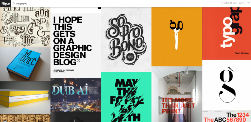
Typography Niice results

A search for typography. I had to do a lot of shuffling to fit all my favourite images into one screenshot.

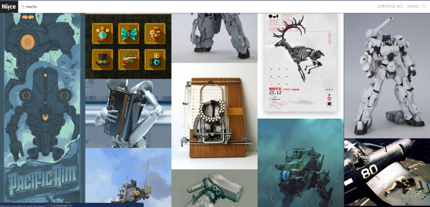
Mechs on Niice

Mechs! I hadn’t realised how gorgeous the Pacific Rim posters were until this search.

While I don’t do a lot of design work, I expect I’ll be back frequently for topic-based inspiration.

—//—

Bonus DesignTAXI article: 3D printed armour for Barbie

Games that teach

The education industry is currently getting very excited about the potential for games as a teaching tool. Watching this unfold (especially at the PAX game conference last year), I’ve seen a lot of attempts to combine two distinct categories: educational games that bore people to tears and fun games that only teach by accident.

For a big step in the way we think about a third category: games that teach people how to play the game.

While there are a few fantastic games that do this, two come immediately to mind for me: Portal and Braid.

While Portal is excellent at teaching players about physics (conservation of momentum for the win!), it also carefully teaches each new player how to move, jump, place portals and correct for orientation and useful angles. Most importantly, it does so with humour and story, keeping experienced gamers engaged while it makes sure that new players have a chance to make sense of the system before they’re thrown into the action.

The opening of Portal 2 is a perfect example of this. While new players are learning to jump, Wheatley (the round robot) is entertaining the experienced players, ensuring that both audiences are engaged as the game continues.

In contrast, Braid teaches you to jump, and to move, and expects you to work everything out from there, including the mechanisms for the different types of time travel that you use through the game. While this sounds infuriating (and, I’ll admit, is something that occasionally drives me into the welcoming arms of walk-throughs), it’s an excellent fit for the game style, which is driven by the satisfaction of problem solving. Once you’ve conquered the early levels, you know there’s a solution to the level that you’ll be able to work out with the tools they’ve taught you to use.

When building educational games, we need to harness this approach to teaching in games, using the learning elements as keys to success within a fun game, rather than expecting players to automatically enjoy the lessons as an end in themselves. Doing so will give the player the guarantee they need that there is a solution in sight, and will support useful tools like ability to adjust difficulty based on a student’s previous achievements. More importantly, it will help to make learning easier for students of all ages.

—//—

P.S. Mulling this over with a friend today, I’m convinced that one of the biggest barriers here is getting the games part of educational games taken seriously so that they’re a) actually fun! and b) are designed to be excellent games as well as educational tools. I’ll be musing on this in the next few weeks.